Linear Gradient Colors Generator Using HTML, CSS, and JavaScript
By Bytewebster - April 10, 2023
Welcome to bytewebster javascript projects on building a Linear Gradient Colors Generator Using HTML, CSS, and JavaScript.
With this project, you'll learn how to create a custom gradient generator that you can use on your own website.
Throughout this project, we'll be walking you through the process of building the generator, step-by-step.
Working
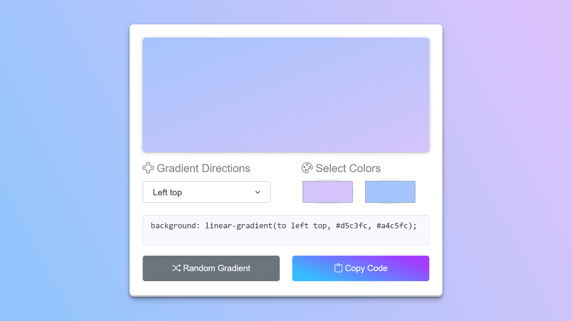
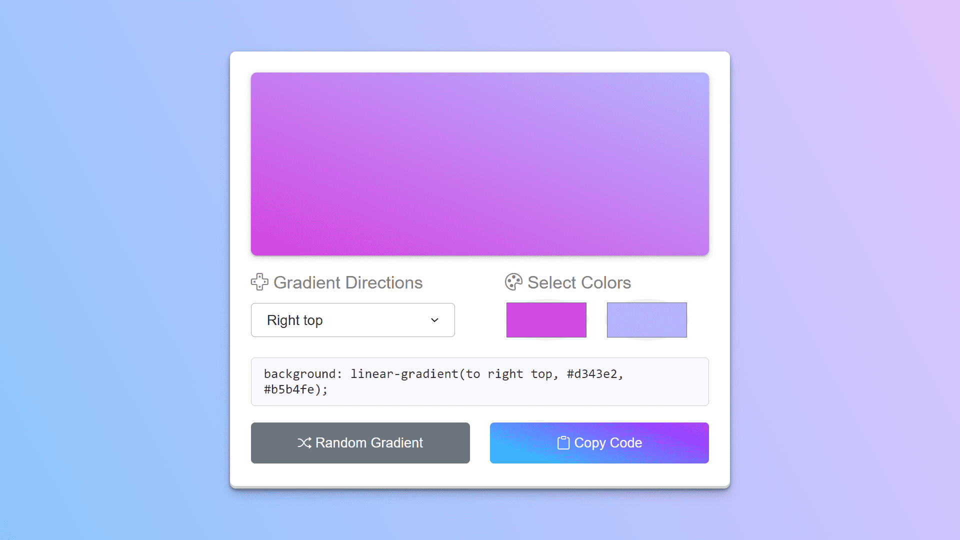
The Linear Gradient Colors Generator is a tool that allows you to create and customize linear gradient colors. It usually consists of an interface where you can change the gradient's parameters such as the colours, direction, and type. The tool typically works by real-time updating the CSS code of an HTML container element as you change the parameters.
Detailed Overview of Project
Using a gradient generator instead of manually writing CSS code can save a lot of time and effort. The interface allows you to easily customise the gradient with a few clicks or keystrokes, and the generator will automatically update the code.
You can also quickly and easily experiment with different colour combinations, gradient directions, and gradient types using this generator without having to manually adjust the code each time.
HTML Structure
Creating the HTML structure for this tool is both amazing and simple. Although some may find the HTML structure complex, we designed it to be as appealing and unique as possible. Let's take a look at its HTML section now.
It is made up of several elements that are arranged within a container element with the class "wrapper." The tool's main functionality is controlled by two elements with the classes "direction" and "palette."
The "direction" element includes a dropdown menu with eight gradient direction options and text that describes the purpose of the dropdown. The gradient's direction is determined by the option chosen.
<div class="wrapper">
    <div class="gradient-box"></div>

    <div class="row options">
        <div class="column direction">
            <p><i class="bi bi-dpad"></i> Gradient Directions</p>

            <div class="select-box">
                <select>
                    <option value="to top">Top</option>
                    <option value="to right top">Right top</option>
                    <option value="to right">Right</option>
                    <option value="to right bottom">Right bottom</option>
                    <option value="to bottom">Bottom</option>
                    <option value="to left bottom">Left bottom</option>
                    <option value="to left">Left</option>
                    <option value="to left top" selected>Left top</option>
                </select>
            </div>
        </div>

        <div class="column palette">
            <p><i class="bi bi-palette"></i> Select Colors</p>

            <div class="colors">
                <input type="color" value="#ebfa2b" />
                <input type="color" value="#20edc3" />
            </div>
        </div>
    </div>
    <textarea class="row" disabled>background: linear-gradient(to left top, #f1ff2e, #26f2ca);</textarea>

    <div class="row buttons">
        <button class="refresh"><i class="bi bi-shuffle"></i> Random Gradient</button>
        <button class="copy"><i class="bi bi-clipboard"></i> Copy Code</button>
    </div>
</div>
The "palette" element contains two colour inputs that allow the user to choose the colours for the gradient. Colors can be chosen by clicking on the colour inputs, which brings up a colour picker.
The tool also includes a disabled textarea element that displays the gradient's CSS code. The CSS code is generated based on the direction and colours chosen.
Finally, there are two buttons with classes of "refresh" and "copy". The "refresh" button generates a random gradient by selecting a random direction and two random colors. The "copy" button copies the generated CSS code to the clipboard, allowing the user to easily paste it into their own CSS files.
Styling With CSS
Now that the structure of this linear gradient colors generator is complete, it is time to create its interface. The CSS helps to create a visually pleasing and user-friendly interface for generating custom gradient colors.
Firstly the body element sets some basic styles, such as padding, background color, and font family, to make the page more visually appealing and readable. Then the .wrapper class is used to create a container element that holds all the color generator elements.
The .gradient-box class defines the styles for a preview box that displays a preview of the gradient color. This creates a visually striking and dynamic effect that showcases the gradient color in action. The .row class sets the styles for a row of color generator options. It sets the display, margin, and justify-content properties, which creates a clean and organized layout for the options.
body {
  padding: 0 10px;
  display: flex;
  align-items: center;
  justify-content: center;
  min-height: 100vh;
  background-color: #8EC5FC;
  background-image: linear-gradient(62deg, #8EC5FC 0%, #E0C3FC 100%);
  font-family: arial;
}

.wrapper {
  width: 600px;
  padding: 25px;
  background: #fff;
  border-radius: 7px;
  box-shadow: rgba(0, 0, 0, 0.4) 0px 2px 4px, rgba(0, 0, 0, 0.3) 0px 7px 13px -3px, rgba(0, 0, 0, 0.2) 0px -3px 0px inset;
}

.wrapper .gradient-box {
  height: 220px;
  width: 100%;
  border-radius: 7px;
  box-shadow: rgba(60, 64, 67, 0.3) 0px 1px 2px 0px, rgba(60, 64, 67, 0.15) 0px 2px 6px 2px;
  background: linear-gradient(to bottom, #ebfa2b, #20edc3);
}

.wrapper .row {
  display: flex;
  margin: 20px 0;
  justify-content: space-between;
}

.options p {
  font-size: 1.4rem;
  color: #7d8281;
  margin-bottom: 8px;
}

.row :where(.column, button) {
  width: calc(100% / 2 - 12px);
}

.options .select-box {
  position: relative;
  top: 5px;
  border-radius: 5px;
  padding: 10px 15px;
  border: 1px solid #aaa;
}

.select-box select {
  width: 100%;
  border: none;
  outline: none;
  font-size: 1.12rem;
  background: none;
}

.options .palette {
  margin-left: 60px;
}

.palette input {
  height: 41px;
  width: calc(100% / 2 - 20px);
}

.palette input:last-child {
  margin-left: 6px;
}

.wrapper textarea {
  width: 100%;
  color: #333;
  font-size: 1.05rem;
  background: ghostwhite;
  resize: none;
  padding: 10px 15px;
  border-radius: 5px;
  border: 1px solid #ccc;
}

.buttons button {
  padding: 15px 0;
  border: none;
  outline: none;
  color: #fff;
  margin: 0 0 -15px;
  font-size: 1.09rem;
  border-radius: 5px;
  cursor: pointer;
  transition: 0.3s ease;
}

.colors input[type="color"] {
  border: none;
  width: 100px;
  height: 50px;
  margin-right: 10px;
  border-radius: 50%;
}

.buttons .refresh {
  background: #6C757D;
}

.buttons .refresh:hover {
  background: #5f666d;
}

.buttons .copy {
  background: linear-gradient(19deg, #21D4FD 0%, #B721FF 100%);
}

.buttons .copy:hover {
  background: linear-gradient(19deg, #21D4FD 0%, #B721FF 50%);
}
The :where() pseudo-class is used to select all elements with the .column or button class inside the .row class. It sets the width property using the calc() function, which calculates a value based on the width of the parent element. This ensures that each option is evenly spaced and sized.
The .options .select-box class sets the styles for a select element, which allows the user to choose a specific color palette. Overall, this CSS code is an important part of creating a great looking and user-friendly linear gradient colour generator webpage.
JavaScript Explanation
This code is a JavaScript implementation of a Linear Gradient Colors Generator, which allows users to create and customise two-color linear gradients.
The code first uses the document.querySelector method to select various HTML elements on the page, such as the gradient-box element, the select-box select element, the color input elements, the textarea element, and the refresh and copy buttons.
Next, the code defines a function called getRandomColor that generates a random hexadecimal color code. The generateGradient function is responsible for generating the linear gradient and updating the user interface. It takes a boolean argument isRandom that specifies whether to generate random colors or use the colors currently selected by the user.
If isRandom is true, the function calls getRandomColor to generate two random colors for the gradient. The function then constructs a CSS linear-gradient string using the values of the selectMenu and colorInputs elements, and sets the background property of the gradientBox element to the gradient.
const gradientBox = document.querySelector(".gradient-box");
const selectMenu = document.querySelector(".select-box select");
const colorInputs = document.querySelectorAll(".colors input");
const textarea = document.querySelector("textarea");
const refreshBtn = document.querySelector(".refresh");
const copyBtn = document.querySelector(".copy");

const getRandomColor = () => {

    const randomHex = Math.floor(Math.random() * 0xffffff).toString(16);
    return `#${randomHex}`;
}

const generateGradient = (isRandom) => {
    if(isRandom) {
        colorInputs[0].value = getRandomColor();
        colorInputs[1].value = getRandomColor();
    }

    const gradient = `linear-gradient(${selectMenu.value}, ${colorInputs[0].value}, ${colorInputs[1].value})`;
    gradientBox.style.background = gradient;
    textarea.value = `background: ${gradient};`;
}

const copyCode = () => {

    navigator.clipboard.writeText(textarea.value);
    copyBtn.innerHTML = "<i class='bi bi-clipboard-check'></i> Code Copied";
    setTimeout(() => copyBtn.innerHTML = "<i class='bi bi-clipboard'></i> Copy Code", 1600);
}

colorInputs.forEach(input => {

    input.addEventListener("input", () => generateGradient(false));
});

selectMenu.addEventListener("change", () => generateGradient(false));
refreshBtn.addEventListener("click", () => generateGradient(true));
copyBtn.addEventListener("click", copyCode);
The copyCode function uses the navigator.clipboard.writeText method to copy the CSS code for the gradient to the clipboard, and updates the copyBtn element to indicate that the code has been copied.
Finally, the code adds event listeners to the color input elements, the selectMenu element, the refresh button, and the copy button to call the generateGradient and copyCode functions in response to user actions such as input changes, button clicks, and select changes.
We are grateful for your time and attention, and we trust that you have found the project to be interesting.
Video of the Project
Take This Short Survey!
Download Source Code Files
From here You can download the source code files of this linear gradient colors generator.
If you are just starting in web development, these snippets will be useful. We would appreciate it if you would share our blog posts with other like-minded people.
ByteWebster Play and Win Offer.

PLAY A SIMPLE GAME AND WIN PREMIUM WEB DESIGNS WORTH UPTO $100 FOR FREE.
PLAY FOR FREE
