Login & Signup Form Switcher Using HTML, CSS and Javascript
By Bytewebster - October 04, 2022
Welcome to the bytewebster Project blogs.
In this front-end project, we will show you how you can create a login and signup form switcher. This project is very easy to make and we have also added some very basic JavaScript code.
In this, we have given complete information about the project in this article along with the source code. Let us first know how it works
Working:
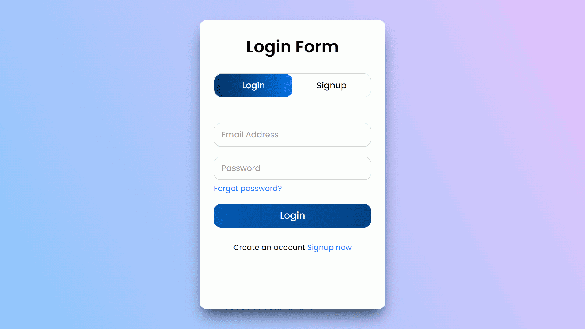
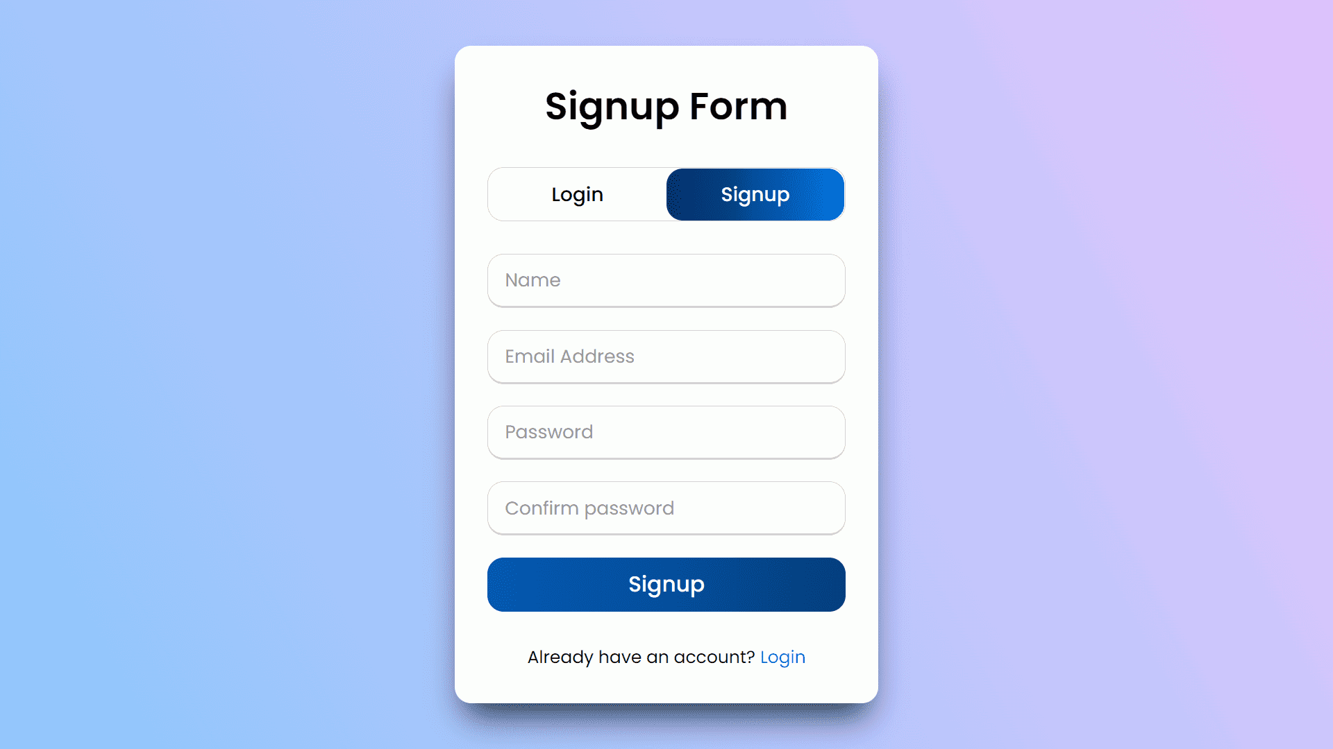
There are two buttons available in this form, the first is to log in and the second is to signup, Which easily switches to another form without refreshing the page And in all the input fields of these two forms, we have set the required attribute to it. Which will prevent these forms from being submitted without filling
Detailed Overview of Project
If you want to make this switching form by yourself without downloading the source code files. So then here you have to create three main files The first file will be HTML second will be CSS and the last will be JavaScript and then you have to take those files to your text editor where you will create this project.
HTML Structure
We have made its HTML structure first which is very easy, for this you do not even need to write any external code. So let's know how it is made and how you can make it.
We start by creating a wrapper class which is created by using the div tag. the wrapper for all of the content in this page.
It has two main sections: one that says "Login Form" and another that says "Signup Form". Inside these sections, there are two other divs: one called "title-text" and another called "form-container".
The form-container contains three input fields, each labeled with its corresponding slide name ("slide login", "slide signup", etc.). Inside the form-container, there is a label for each input field which will change color depending on whether it's checked or not.
There are also radio buttons to allow users to choose between either logging in or signing up as well as some labels telling them what they're choosing ("login", "signup"). This HTML code will have the following outcome: If a user selects "Login" from the radio button, they will be redirected to the Login Form. If a user selects "Signup" from the radio button, they will be redirected to the Signup Form.
<div class="wrapper">
      <div class="title-text">
        <div class="title login">Login Form</div>
        <div class="title signup">Signup Form</div>
      </div>
      <div class="form-container">
        <div class="slide-controls">
          <input type="radio" name="slide" id="login" checked>
          <input type="radio" name="slide" id="signup">
          <label for="login" class="slide login">Login</label>
          <label for="signup" class="slide signup">Signup</label>
          <div class="slider-tab"></div>
        </div>
        <div class="form-inner">
          <form action="#" class="login">
            <pre>
            </pre>
            <div class="field">
              <input type="text" placeholder="Email Address" required>
            </div>
            <div class="field">
              <input type="password" placeholder="Password" required>
            </div>
            <div class="pass-link"><a href="#">Forgot password?</a></div>
            <div class="field btn">
              <div class="btn-layer"></div>
              <input type="submit" value="Login">
            </div>
            <div class="signup-link">Create an account <a href="">Signup now</a></div>
          </form>
          <form action="#" class="signup">
            <div class="field">
              <input type="text" placeholder="Name" required>
            </div>
            <div class="field">
              <input type="text" placeholder="Email Address" required>
            </div>
            <div class="field">
              <input type="password" placeholder="Password" required>
            </div>
            <div class="field">
              <input type="password" placeholder="Confirm password" required>
            </div>
            <div class="field btn">
              <div class="btn-layer"></div>
              <input type="submit" value="Signup">
            </div>
            <div class="signup-link">Already have an account? <a href="">Login</a></div>
          </form>
        </div>
      </div>
    </div>
Styling With CSS
Now that the HTML is complete, now it is time to style this form which we will do using CSS.
First We start from define the grid layout in HTML or body tags. It defines how many columns and rows there are, where they should be placed on the page, and what colors they should use. And then inside this, we give a background-image property for setting up a linear gradient from light blue to dark blue.
Now we start by styling the wrapper class. it has an overflow of hidden and a max width of 390px. The next line is the main content div, which will have its own CSS properties applied to it later on in the code.
it has a wrapper element with a title-text and a title.The title-text will be 200% wide, and the title will be 50% wide. The slide controls are hidden by default in this code.
Then after completing all this, we styled the input fields and its toggler buttons in the same way. We sizing them too and using the same color for both the buttons. You can see this code below, it is a basic code which is also very easy to understand.
@import url('https://fonts.googleapis.com/css?family=Poppins:400,500,600,700&display=swap');
*{
  margin: 0;
  padding: 0;
  box-sizing: border-box;
  font-family: 'Poppins', sans-serif;
}
html,body{
  display: grid;
  height: 100%;
  width: 100%;
  place-items: center;
  /*background-color: #8EC5FC;*/
  background-image: linear-gradient(62deg, #8EC5FC 0%, #E0C3FC 100%);
}
::selection{
  background: #1a75ff;
  color: #fff;
}
.wrapper{
  overflow: hidden;
  max-width: 390px;
  background: #fff;
  padding: 30px;
  border-radius: 15px;
  box-shadow: rgb(38, 57, 77) 0px 20px 30px -10px;
}
.wrapper .title-text{
  display: flex;
  width: 200%;
}
.wrapper .title{
  width: 50%;
  font-size: 35px;
  font-weight: 600;
  text-align: center;
  transition: all 0.6s cubic-bezier(0.68,-0.55,0.265,1.55);
}
.wrapper .slide-controls{
  position: relative;
  display: flex;
  height: 50px;
  width: 100%;
  overflow: hidden;
  margin: 30px 0 10px 0;
  justify-content: space-between;
  border: 1px solid lightgrey;
  border-radius: 15px;
}
.slide-controls .slide{
  height: 100%;
  width: 100%;
  color: #fff;
  font-size: 18px;
  font-weight: 500;
  text-align: center;
  line-height: 48px;
  cursor: pointer;
  z-index: 1;
  transition: all 0.6s ease;
}
.slide-controls label.signup{
  color: #000;
}
.slide-controls .slider-tab{
  position: absolute;
  height: 100%;
  width: 50%;
  left: 0;
  z-index: 0;
  border-radius: 15px;
  background: -webkit-linear-gradient(left,#003366,#004080,#0059b3
, #0073e6);
  transition: all 0.6s cubic-bezier(0.68,-0.55,0.265,1.55);
}
input[type="radio"]{
  display: none;
}
#signup:checked ~ .slider-tab{
  left: 50%;
}
#signup:checked ~ label.signup{
  color: #fff;
  cursor: default;
  user-select: none;
}
#signup:checked ~ label.login{
  color: #000;
}
#login:checked ~ label.signup{
  color: #000;
}
#login:checked ~ label.login{
  cursor: default;
  user-select: none;
}
.wrapper .form-container{
  width: 100%;
  overflow: hidden;
}
.form-container .form-inner{
  display: flex;
  width: 200%;
}
.form-container .form-inner form{
  width: 50%;
  transition: all 0.6s cubic-bezier(0.68,-0.55,0.265,1.55);
}
.form-inner form .field{
  height: 50px;
  width: 100%;
  margin-top: 20px;
}
.form-inner form .field input{
  height: 100%;
  width: 100%;
  outline: none;
  padding-left: 15px;
  border-radius: 15px;
  border: 1px solid lightgrey;
  border-bottom-width: 2px;
  font-size: 17px;
  transition: all 0.3s ease;
}
.form-inner form .field input:focus{
  border-color: #1a75ff;
  /* box-shadow: inset 0 0 3px #fb6aae; */
}
.form-inner form .field input::placeholder{
  color: #999;
  transition: all 0.3s ease;
}
form .field input:focus::placeholder{
  color: #1a75ff;
}
.form-inner form .pass-link{
  margin-top: 5px;
}
.form-inner form .signup-link{
  text-align: center;
  margin-top: 30px;
}
.form-inner form .pass-link a,
.form-inner form .signup-link a{
  color: #1a75ff;
  text-decoration: none;
}
.form-inner form .pass-link a:hover,
.form-inner form .signup-link a:hover{
  text-decoration: underline;
}
form .btn{
  height: 50px;
  width: 100%;
  border-radius: 15px;
  position: relative;
  overflow: hidden;
}
form .btn .btn-layer{
  height: 100%;
  width: 300%;
  position: absolute;
  left: -100%;
  background: -webkit-linear-gradient(right,#003366,#004080,#0059b3
, #0073e6);
  border-radius: 15px;
  transition: all 0.4s ease;;
}
form .btn:hover .btn-layer{
  left: 0;
}
form .btn input[type="submit"]{
  height: 100%;
  width: 100%;
  z-index: 1;
  position: relative;
  background: none;
  border: none;
  color: #fff;
  padding-left: 0;
  border-radius: 15px;
  font-size: 20px;
  font-weight: 500;
  cursor: pointer;
}
JavaScript Explanation
We have also used a little JavaScript in it so that this form can be made in a better way
The Javascript code of this form starts by selecting the login form. It then selects the text that says "Login" and changes its margin to 50%. Next, the code finds a text field that has "login" in it and changes its margin to 50%.
Finally, the code clicks on both of these buttons at once. The first button will change the left margin of all elements inside of loginForm to 0% while clicking it.
The second button will change the left margin of all elements inside of loginForm to -50% while clicking it. The code is used to change the margin of the login form and login text.
const loginText = document.querySelector(".title-text .login");
      const loginForm = document.querySelector("form.login");
      const loginBtn = document.querySelector("label.login");
      const signupBtn = document.querySelector("label.signup");
      const signupLink = document.querySelector("form .signup-link a");
      signupBtn.onclick = (()=>{
        loginForm.style.marginLeft = "-50%";
        loginText.style.marginLeft = "-50%";
      });
      loginBtn.onclick = (()=>{
        loginForm.style.marginLeft = "0%";
        loginText.style.marginLeft = "0%";
      });
      signupLink.onclick = (()=>{
        signupBtn.click();
        return false;
      });
Thank you for spending your valuable time in reading this article. We hope you liked the project.
Video of the Project
Take This Short Survey!
Download Source Code Files
From here You can download the source code files of this Login & Signup form switcher
If you are just starting in web development, these snippets will be useful. We would appreciate it if you would share our blog posts with other like-minded people.
ByteWebster Play and Win Offer.

PLAY A SIMPLE GAME AND WIN PREMIUM WEB DESIGNS WORTH UPTO $100 FOR FREE.
PLAY FOR FREE
